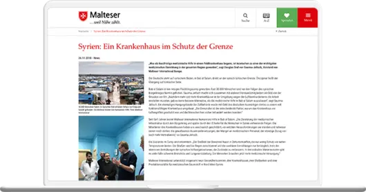
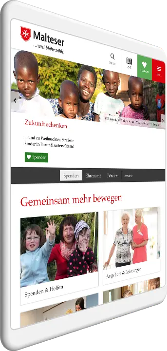
Award-winning portal of Malteser unites 700 websites under one roof.
The winner is...
The +Pluswerk team is doing far more than providing first aid in the migration of the Malteser Hilfsdienst's 700 or so websites nationwide. In a true large-scale operation, the agency is realizing a state-of-the-art concept: strategically, visually and technically. A task that requires strong nerves, experience and a large team. And crowned with success: with the German Design Award 2018 and the Econ Award 2017, the project can score at two renowned awards.
Despite the highest complexity and more than 50,000 pages, all content is presented as a unit after the migration. The concept consistently focuses on information and clarity - and takes into account the different requirements of the heterogeneous target group for a sophisticated web design.
Since 2010, +Pluswerk has been providing Malteser with graphic, technical and conceptual support - both nationally and internationally.
Highlights
- Honored with 2 Awards
- 700 sites, 50.000 pages, one TYPO3 installation
- 3.000 backend users
- 1,2 million visitors / month
- 7 million PI's / month
About Malteser
More than one million members make Malteser Hilfsdienst e.V. one of the largest and best-known charitable service providers in Germany. Present since 1953, the association is now represented in more than 700 locations and is also active internationally.
Under the sign of the iconic Knight's Cross, Malteser is involved in disaster control, rescue and emergency preparedness. Whether in the ambulance service, in first aid training and in the voluntary social services - the helpers of the association are represented in all areas. Malteser is also active internationally and supports partners all over the world.
Since 2010, the relief service has relied on the expertise of +Pluswerk - with excellent success!
Concept & Design
A modern concept makes the diversity and contemporary concept of the aid service even more tangible. Information is conveyed more quickly and at the same time better absorbed thanks to an optimized structure. The clear design does not puzzle the diverse stakeholders and ensures a high recognition value.
The eye-catching donation function, symbolized by a heart, ensures increased acceptance and click-through rates with high awareness.
As a further centerpiece, the modern media wall draws attention to current event, on-site actions and posts from the social networks.
Solution and technical implementation
- The responsive layout introduced back in 2014 guarantees full functionality and a clear, user-friendly display even on mobile devices.
- The Media Wall, which is connected to various social media APIs, allows interesting content to be shared.
- A well thought-out grid system serves as an easy-to-understand tool for editors - even without in-depth specialized knowledge.


