The German Red Cross (DRK) is one of the leading humanitarian organisations in Germany and part of the worldwide International Red Cross and Red Crescent Movement.

Project overview
The new website of the German Red Cross
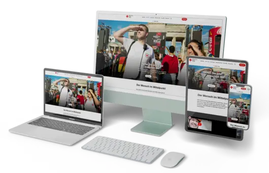
The German Red Cross Federal Association has completely revamped its website, focussing on "mobile first" in UX and UI. This is intended to better address one of the main target groups - smartphone users who use their mobile phones for donations. In addition, the extensive content of the old website was difficult to access and not very visible, which also made the work of the DRK editors more difficult.
TYPO3 version 11.5 LTS was used for the relaunch, supported by powerful Docker hosting. An inventory of the content led to the restructuring of over 4,000 content pages. The important donation module was also greatly improved to cope with peak loads and offers high performance across all existing payment options. Load tests ensured the performance of the new module.
The redesign of the front end includes emotional images and graphics to better appeal to the target group and sustainably increase the willingness to donate in the long term. Overall, the relaunch has improved the user experience and the user interface. Supported by faster loading times and further SEO optimisations, this has led to measurably and sustainably higher Google rankings.

As a result, users are more at the centre of attention
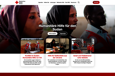
The relaunch of the German Red Cross (DRK) website by +Pluswerk has brought remarkable results. A key success was the implementation of the new "Mobile First" view, including a desktop view based on it. The new TYPO3 basis enabled an improved navigation structure with guided menus that lead the user efficiently and intuitively to the desired content. These menus are visually appealing and feature a page-wide over-the-top menu that minimises when scrolling, contributing to an aesthetic and functional improvement.
All of this has significantly improved the user experience (UX) and user interface (UI). In particular, the faster frontend with greatly reduced loading times contributes to a more pleasant user experience. Together with other simultaneous SEO optimisations such as optimised page speed and screen-size-based media files, all the key criteria for a high Google ranking are met. The bottom line is that the new DRK homepage is simpler and more attractive - for editors and users alike.
From unclear to highly visible
During the Covid 19 pandemic, the DRK Bundesverband set itself the task of fundamentally modernising its existing website. The central focus was on a consistent and consistent "mobile first" approach in both the UX and the UI. The DRK is largely financed by donations and most donors today use their smartphones for this purpose - this target group was to be optimally addressed after the relaunch.
Another reason for the relaunch was to restructure the content of the homepage. The DRK homepage contained a huge amount of content with several thousand individual websites, but these were no longer sufficiently accessible. Some of the websites were practically invisible to the user from the homepage - they neither appeared in the menu structure nor were they connected to each other by internal links. This led to considerable difficulties - also for the online editors of the GRC, who sometimes had to resort to Google searches to find content on their own homepage.
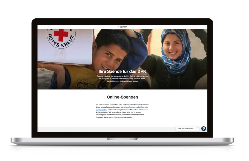
One of the most important components of the DRK homepage is the online donation system. Here, the UX and UI of the donation page were to be fundamentally modernised in line with the mobile-first approach. In addition, the old system had significant performance problems, especially at peak times such as crisis situations or during the Christmas period. With more than half a dozen connected payment service providers, the development of a more efficient system was imperative. Previously, a collapse of the donation page in times of crisis regularly led to a drop in donations.
Better and more beautiful: content inventory and front-end design
For the relaunch of the DRK website, we first relaunched TYPO3 version 11.5 LTS. All existing content was taken over and imported into the new system. A key feature of the new installation is high-performance Docker hosting, which was specially developed for the DRK's requirements. In addition, +Pluswerk implemented a comprehensive Solr search from Apache.
The second decisive step was to carry out a comprehensive content inventory of the DRK website, which comprises several thousand individual pages. Based on this inventory, we developed new technical and content evaluation criteria that enabled the DRK's knowledge holders to decide whether to retain, modify or delete content elements.
Following the successful inventory, the content was restructured, with the majority being transferred to the revised TYPO3 editorial module and reorganised on the upper menu levels. This reorganisation resulted in several thousand individual but now sensibly accessible content pages, which considerably simplifies the work of the DRK editors and makes the homepage more attractive for users.
High-performance dispensing module for high-load times
Another central element of the project was the revision of the donation module in order to keep it efficient even with a high number of enquiries. The available payment service providers were bundled so that donations can now be made by direct debit, PayPal, online bank transfer and credit cards. In addition, a clear "Donate" CTA button is now clearly visible on every website, customised to the respective content.
The operation of the donation module for fundraising employees in the backend has also been simplified and made easier to use. In order to guarantee the availability of the donation module even with many parallel requests, we carried out extensive load tests that simulated a high four-digit number of simultaneous donors. With the new donation module, the DRK is now optimally positioned for many years to come.
On the design level, we have completely overhauled the front end of the DRK homepage. In the new design, the homepage now uses attractive, large-format images and graphics for an emotional appeal to the DRK target groups. The new quality of information now available on the specific projects increases the willingness to donate and promotes sustained interest in specific aid projects.


![[Translate to English:] [Translate to English:]](/fileadmin/_processed_/5/9/csm_konzeption_1db8152b65.jpeg)