The Helmholtz Centre for Infection Research (HZI) is a leading research institution in Germany specializing in the fight against infectious diseases. With locations in Braunschweig, Hamburg, Hanover, Saarbrücken, Würzburg and Greifswald, the HZI is dedicated to the investigation of infection mechanisms and their defense.
The HZI research program focuses on the translation of scientific findings into medical applications in order to develop effective methods of diagnosis, prevention and treatment. Through interdisciplinary collaboration and international cooperation, the centre makes significant contributions to health security.

TYPO3 Award 2024 Winner in the ‘Health’ category
We are delighted: +Pluswerk won the TYPO3 Awards at T3CON24 in the Health category with the new HZI website. The project has taken visual science communication in the DACH region to a new level. We would like to thank the Helmholtz Center for their trust and are already looking forward to the next innovative TYPO3 projects.
Project Summary
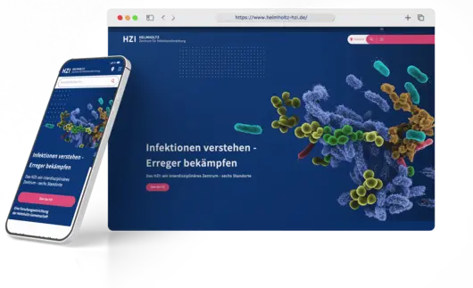
The Helmholtz Centre for Infection Research (HZI) has redesigned its website with the aim of making infection research more accessible to the public. With the help of TYPO3 and the special TYPO3 Higher Education Package, developed in cooperation with +Pluswerk, a modern, responsive website was created that offers a clear, concise and user-friendly presentation of the research work.
Visual elements such as high-quality images and videos support the scientific content and encourage user interaction. The new website is accessible and offers an improved user experience, especially on mobile devices. The redesign has enabled the HZI to strengthen its online presence and effectively communicate the importance of infection research.
As a result, the HZI has received a state-of-the-art website that offers all the advantages of the secure and established TYPO3 system. The modern design guides visitors to the HZI's diverse offerings based on topics and interests. Infection research as a topic is now more interesting, more appealing and easier than ever to find on the Internet.
Infection research more accessible
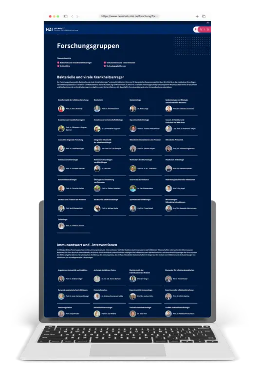
The relaunch of the HZI website led to significant improvements. The presentation of all research groups has been optimized on a clearly arranged page according to main research topics and all Helmholtz locations have been clearly integrated. There are now simple links to the individual locations.
The new website now follows a "mobile first" approach with user-friendly navigation and a low-barrier design that also enables keyboard navigation if required. Loading times and performance on mobile devices have been optimized to improve the user experience.
Use cases
Focus on visual science communication
The aim of the relaunch of the HZI website was to make the topic of infection research more understandable and accessible to the public. To this end, the new site was designed to be clearer, more concise and more transparent in order to offer visitors a positive and helpful user experience. We have created a modern, responsive and accessible website that optimally reflects the image and brand identity of the institute and is visually appealing.
The new, appealing design draws visitors' attention and invites them to interact with the HZI's various media offerings. The integration of visual elements such as high-quality images, graphics and videos was essential in order to arouse interest and effectively support the Institute's scientific messages. As a result, the new website makes it clear at first glance how important the topic of infection research is for the general health of society.
Effective web solution: relaunch with TYPO3
We chose the established TYPO3 CMS for the technical foundation of the relaunch. It was supplemented by the TYPO3 Higher Education Package, which was developed by +Pluswerk in cooperation with TYPO3 especially for educational and research institutions. We used the EDU package's Kickstarters department to easily create new microsites within the system as required by the client. A powerful search and filtering of the content was realized with SOLR.
An automated import and a visually adapted display were implemented for the publication database of the new site. We have also successfully migrated 1,071 old news data records that have been created since 2017 and beyond and integrated them into the new system. On the design side, special emphasis was placed on interactive elements, a coherent and balanced color palette and easy-to-read typography for body text and headlines to improve the visual hierarchy and readability.


![[Translate to English:] [Translate to English:]](/fileadmin/_processed_/3/f/csm_webdesign_9efc48467a.jpeg)