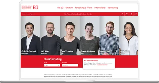
Small but nice. University appearance with a personal touch.
One website - many faces
Bochum University of Applied Sciences presents itself with a personal touch and intuitive user guidance. At first click, students, employees and potential applicants now benefit from the high-performance, easy-to-use user interface and the structured menu navigation. The same applies to the maintenance and usability by university staff.
The enterprise CMS TYPO3 used guarantees employees intuitive creation and maintenance of content in the backend. Without in-depth technical know-how, content in the form of images, videos or text can be published on the platform - technically stable and secure.
Highlights
- Quick direct access to topics thanks to "Quick Finder
- News & social media at a glance in the media wall
- Lean and customized solution thanks to agile implementation
- UX-optimized fly-out navigation
About Bochum University
Compared to other universities in the region, the Bochum University of Applied Sciences, with around 7,000 students, is considered to be manageable and personal. A fact that the university with its six departments likes to advertise and flirt with. With its focus on "Construction", "Engineering" and "Business", the university aims to provide the most career-ready education possible through close cooperation with companies in the region.
In Europe's densest university landscape, the university presents itself as a small, fine and innovative alternative. And it communicates this USP visually and in terms of content via its independent online presence.
Agile project management
The entire project was designed in an agile manner and implemented with the help of the Scrum framework in a successful collaboration between +Pluswerk AG and Bochum University. "The Scrum method has left a lasting impression on everyone involved. We have already received a lot of positive feedback on the successful new website of the university, praises Nobert Dohms, Head of Department for Communication, Innovation and Transfer at Bochum University, the cooperation with +Pluswerk AG. Despite a very large number of project participants, in the end a digital, customized solution was developed that meets the requirements of the users and contributes to the long-term success of the presentation of the educational institution.
Orientation meets optics
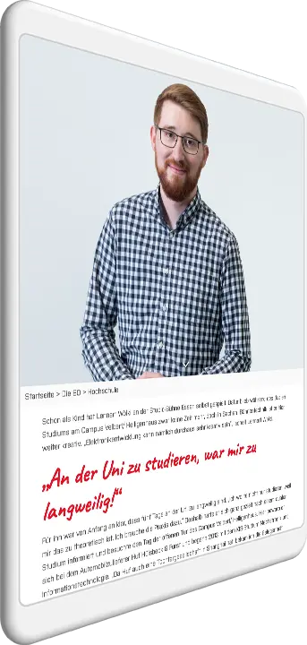
Structured and user-friendly, the Internet presence of the Hochschule Bochum website guides visitors through its online presence. Personal statements and portraits of staff and students give the university a personal touch and set it apart from average "learning factories". A well thought-out navigation concept guides visitors through the content and invites them to engage with the informative content.
A quick entry guides prospective students straightforwardly to current information on the course of study. Filters and landing pages facilitate orientation and enhance the user experience. At first click, students, employees and potential applicants now benefit from a user interface that loads much faster and is easier to use, as well as from structured menu navigation.
The TYPO3 content management system ensures lasting technical stability on the basis of a secure platform. It enables employees to publish or edit images, videos and texts without in-depth know-how.


